There is not one single item in a decorator’s toolbox that has the transformative properties that an unassuming tin of paint has. Like magic, a lick, a wash and a splash of paint can make you feel as though you are inhabiting another space entirely.
This affordable DIY item can render a small space into something palatial [well almost!]. Here are my 5 space enhancing tricks with paint – a rainy afternoon well spent!
1. Half painted walls
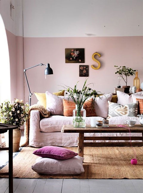
Half painted walls or borders give the illusion of higher ceilings. The beauty of this paint treatment is that you can go as low or as high as you want – it’s the division of colour and shift of eye-line that creates a feeling of height.
2. Paint furniture the same colour as the walls
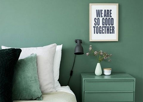
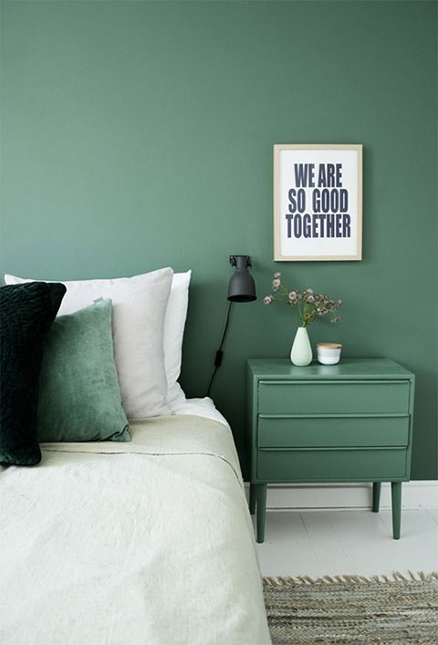
Matching architectural features like shelves or furniture to the wall colour around them unifies items in a small room making the room feel less crowded and more streamlined. It’s also a really fun way to give old possessions new life.
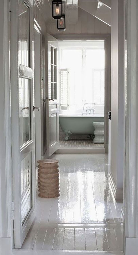
3. Go for gloss
We all know that painting a room white is the key to space enhancement but adding a high shine gloss finish will give the smallest of spaces like this narrow hallway an extra boost. This glossy treatment makes all available light bounce around the space making it feel all the brighter.
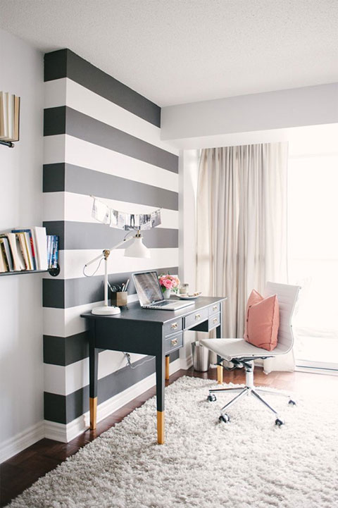
4. Statement stripes
Horizontal stripes make narrow spaces look wider and taping off wide stripes and painting the spaces in-between are fun and easy way to experiment. If you are hesitant to commit to a whole room – try a small statement area like this chimney breast.
5. Dark illusion
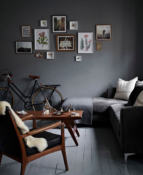
You might feel like you are throwing out the rule book by painting a small space in a dark hue but using rich dark colours is a trick that many interior designers use to create a sense of depth. Warm greys, navy blue or even charcoal can fool the eye into not knowing where the wall begins and ends, creating an illusion of more space.
The Beat That My Heart Skipped
Rohini, of The Beat That My Heart Skipped is a journalist and a trend forecaster for the design industries. The blog provides a range of home inspiration whilst enlightening readers on new design and interiors trends.
For more inspiration from The Beat That My Heart Skipped, visit Rohini’s Pinterest here


Leave a Reply